FORUM UPDATE: The KryptonSite/KSiteTV forums are still working things out for this new forum upgrade; as such, the site might be down intermittently over the next few days.
If this is your first visit, be sure to
check out the FAQ by clicking the
link above. You may have to register
before you can post: click the register link above to proceed. To start viewing messages,
select the forum that you want to visit from the selection below.
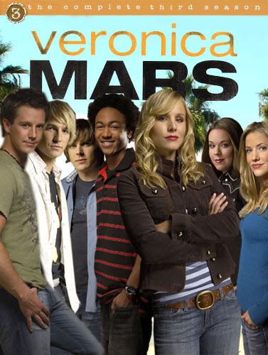
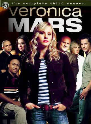
Post your ideas here on how you think the dvd for season 3 should look like. Please use the one-week episode rule, (you are able to use the season three promo images)
The first one looks more authentic, but a little claustrophobic at that.
I think the season three cover, rather than being deep blue like the first season or bright pink (ugh) like the second, should be golden, like the way Hearst usually looks.
ill judge
the first one:
problemo 1- mac is behind parker
2-vm is not in the middle
3-thier different hieghts
4-the pattern of thr positioning is not in a zig zag
5-the boys and girls are on separate sides
6- keith and weevil are missing
good stuf
1-the colours
2-the pictures
3-cut out of photo- outline
4-proportion of photos-sizes of characters
second one:
problemo
1-too much blue
2-thier different hieghts
3-no girls in photo
4-keith and weevil are missing
good stuff
1-the pictures
2-cut out of photo- outline
3-proportion of photos-sizes of chartacters
4-v is in the front
5-v is in the middle
6-v is larger
total props 0n covers if u mesh the good stuff 2gther it will look even more amazing
ps: im a total perfectionist soz 4 been so hard on u!
 Tweet
Tweet


Comment